10 Must Knows about D3.js: Part One
Part One: What is D3?
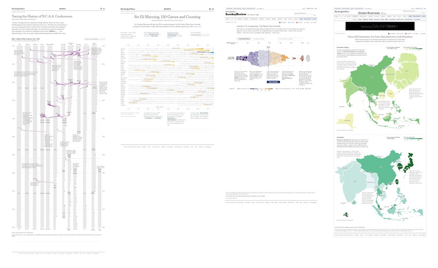
In a nutshell, D3 is a JavaScript library for building custom data visualisations. It’s behind many of the groundbreaking visualisations seen in the New York Times and other leading publications.
It’s a library… but not a ‘library of charts’
D3 is a JavaScript ‘library’ in that it provides coders with a bunch of useful tools (or components). However it isn’t a charting library like Google Charts or HighCharts where you can choose from a selection of charts into which you plug your data. This makes it more involved to use than something like Highcharts but it’s a lot more flexible and is ideal for creating bespoke interactive data visualisations.
Building blocks
The philosophy of D3 is that if provides a large selection of components that help the building of data visualisations. So rather than providing ready built charts, it provides building blocks for charts.
Scale functions
For example, D3’s scale functions make it very easy to translate from your data values to display co-ordinates.
Say, for example, that you’re working with population data, and you wanted to position some points within a 600 pixel wide area you could do the following:
// Create a scale function for population
var populationScale = d3.scale.linear().domain([0, 1367030000]).range([0, 600]);

populationScale(1367030000); // returns 600  (China)
populationScale(64105654); // returns 28.13  (UK)
D3 creates a function called populationScale for us. The input is the population value whilst the output is a value in pixels.
Axes
Another useful D3 component creates axes for us. On the surface, these may appear straightforward but you have to consider questions such as:
- how many tick marks should I draw? Should I draw them at nice round values?
- what about orientation? (Axes can be oriented top, bottom, left or right.)
- what happens if the scale changes?
- will my component be reusable?
D3 addresses all these concerns with its axis component. Continuing with the population example, if we wanted a horizontal axis, we’d use:
// Create an axis generator
var xAxis = d3.svg.axis().scale(populationScale).orient('bottom');

// Append axis to SVG element
d3.select('svg').call(xAxis);
Don’t like the label formatting? We can fix that:
xAxis.tickFormat(function(d) {
  return d / 1000000000 + 'bn';
});
I won’t go through them one by one in this article but it’s safe to say that D3 supplies components for most data visualisation related tasks, including:
- layouts (to help laying out more sophisticated structures such as trees and networks)
- data loading (to load CSV, JSON etc. into the browser)
- geographic projections
- SVG generators to spare us having to write native SVG
When these components are combined we end up with a very powerful system for building data visualisations.

For example, if we wanted to make a map with pie-chart overlays, we might use:
- d3.json() load the geographic data
- d3.geo.path() to convert from geographic (GeoJSON) data to SVG paths
- d3.geo.projection() to project from latitude & longitude to screen co-ordinates
- pie layout to compute the pie segments
- scale functions to colour the countries
Pick & Mix
It’s also good to realise that we can pick and choose from these components. Scale functions are very useful in themselves, even if no other part of D3 is used. Likewise the functions for loading in CSV or JSON data.
Stay in touch
I’ll be publishing more D3 must knows over the coming months and covering subjects such as scale functions, data joins, enter/exit and lots more. If you’d like to be the first to read the next articles then please add your name to my mailing list and you’ll be the first to receive articles as they’re published.